Visualization in Python
09/02/2022
Data Visualization Tips
Why?
- For us: Explore data, make hypotheses, find trends
- For others: Communicate data or findings
Show the Data
Above else, show the data. Maximize the data-ink ratio.
- Edward Tufte
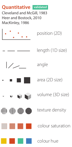
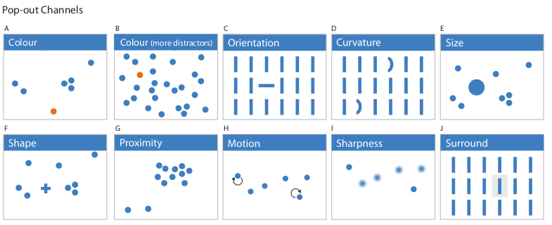
Visual Channels
Colormaps
- Map quantities from number to color
- Whenever you use color, you use one
Sequential
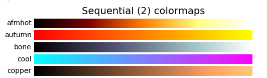
- From one hue (or saturation) to another
- Also change lightness
- Good for extremes
- Little contrast in middle
Diverging
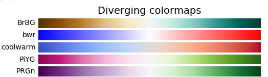
- Focus point in middle
- Great for neutral point + deviations, e.g. profits
Qualitative
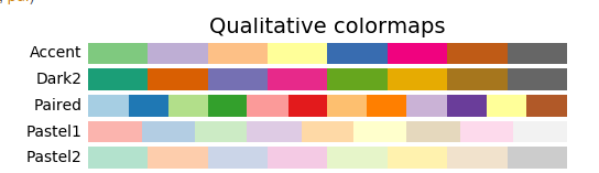
- Show discrete values
- good contrast
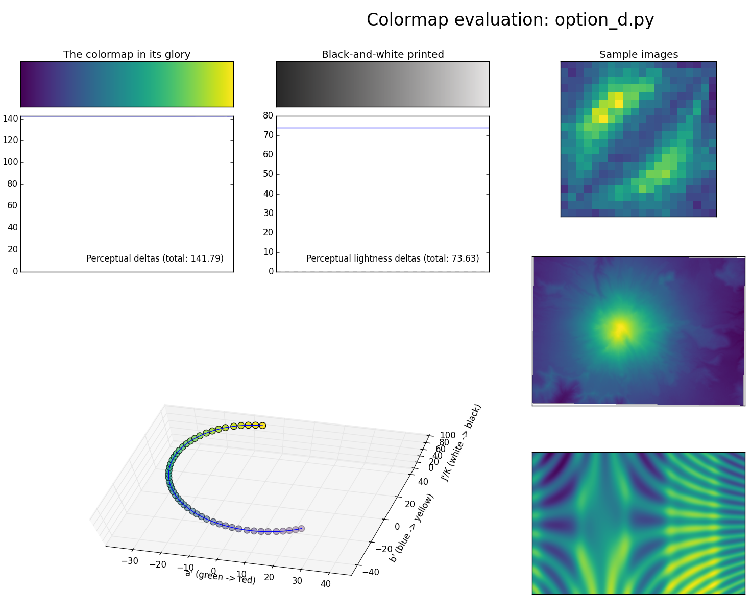
Perceptually Uniform Sequential
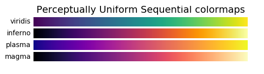
- Carefully designed to show quantitative info
Miscellaneous
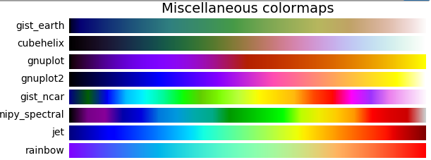
- Lots of others
- Colorful…but actually not that good
Problems
Problems
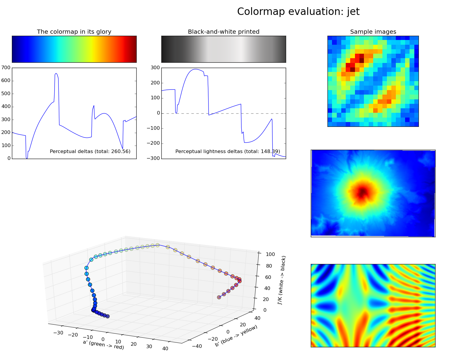
Problems
matplotlib
Alternatives
- pandas: convenience plotting
- seaborn: good for complex statistical plots
- bokeh: produces visualizations for browser
- ggplot translations/interfaces: based on famous
Rplotting library
matplotlib in Jupyter
%matplotlib inline
- sends png to browser
- static image (e.g., no zooming)
- no changes to previous figures
%matplotlib notebook
- interactive widget
- can update previous figures
- need to create separate figures explicitly
Figures and Axes
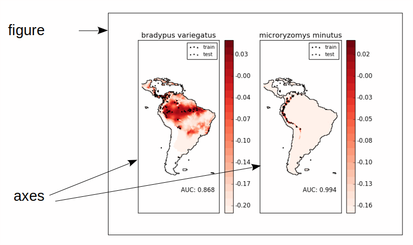
- figure: one window or image file
- axes: one drawing area + coordinate system
Creating Figures and Axes
fig = plt.figure()- Create figure with 1 set of axes
- Can add more later
- Sets "current" figure
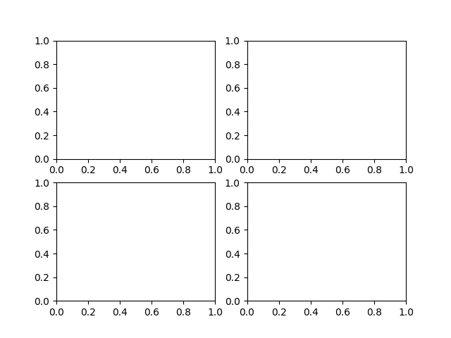
fig, ax = plt.subplots(n, m)- Creates figure with \(n\) x \(m\) axes (regular grid)
- Just plot!
- Automatically creates figure
- Future plot commands will draw on that
More axes
import matplotlib.pyplot as plt
# ax = plt.subplot(n, m, i)
# places ax at position i in n x m grid
# (1-based index)
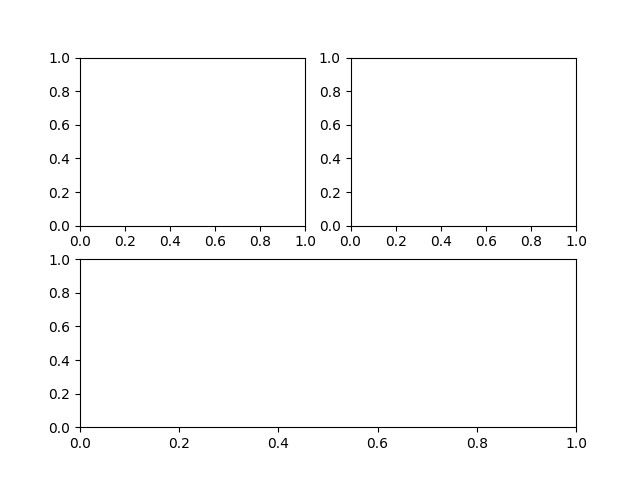
ax11 = plt.subplot(2, 2, 1)
ax21 = plt.subplot(2, 2, 2)
ax12 = plt.subplot(2, 2, 3)
ax22 = plt.subplot(2, 2, 4)
# OR:
# fig, axes = plt.subplots(2, 2)
# ax11, ax21, ax12, ax22 = axes.ravel()
More axes
import matplotlib.pyplot as plt

# ax = plt.subplot(n, m, i)
# places ax at position i in n x m grid
# (1-based index)
ax11 = plt.subplot(2, 2, 1)
ax21 = plt.subplot(2, 2, 2)
ax2 = plt.subplot(2, 1, 2)
Two Interfaces
- Stateful: applies to "current" figure and axes
- Object oriented: explicitly use object
sin = np.sin(np.linspace(-4, 4, 100))
plt.subplot(2, 2, 1)
plt.plot(sin)
plt.subplot(2, 2, 2)
plt.plot(sin, c='r')

fig, axes = plt.subplots(2, 2)
axes[0, 0].plot(sin)
axes[0, 1].plot(sin, c='r')
Two interfaces
plt.title
plt.xlim, plt.ylim
plt.xlabel, plt.ylabel
plt.xticks, plt.yticks
ax = plt.gca()   # get current axes
fig = plt.gcf()  # get current figure
ax.set_title
ax.set_xlim, ax.set_ylim
ax.set_xlabel, ax.set_ylabel
ax.set_xticks, ax.set_yticks (& ax.set_xtick_labels)
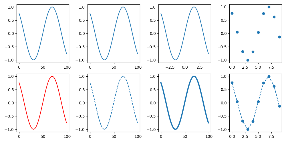
plot
import matplotlib.pyplot as plt
import numpy as np
data = np.sin(np.linspace(-4,4,100))
fig, ax = plt.subplots(2, 4, figsize=(10,5))
ax[0,0].plot(data)
ax[0,1].plot(range(100), data) # same as above
ax[0,2].plot(np.linspace(-4,4,100),data)
ax[0,3].plot(data[::10], 'o')
ax[1,0].plot(data, c='r')
ax[1,1].plot(data, '--')
ax[1,2].plot(data, lw=3)
ax[1,3].plot(data[::10], '--o')
plt.tight_layout() # makes stuff fit - usually works
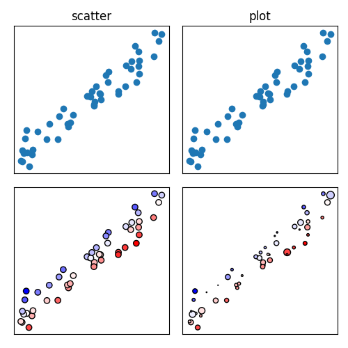
scatter
x = np.random.uniform(size=50)
y = x + np.random.normal(0, .1, size=50) # add noise
fig, ax = plt.subplots(2, 2, figsize=(5,5),
					   subplot_kw={'xticks': (), 'yticks': ()})
ax[0,0].scatter(x,y)
ax[0,0].set_title("scatter")
ax[0,1].plot(x,y,'o')
ax[0,1].set_title("plot")
ax[1,0].scatter(x,y, c=x-y, cmap='bwr', edgecolor='k')
ax[1,1].scatter(x,y, c=x-y, s=np.abs(np.random.normal(scale=20, size=50)),
				cmap='bwr', edgecolor='k')
plt.tight_layout()
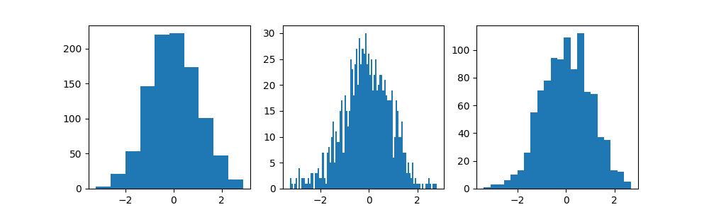
histogram
fig, ax = plt.subplots(1, 3, figsize=(10,3))
ax[0].hist(np.random.normal(size=1000))
ax[1].hist(np.random.normal(size=1000), bins=100)
ax[2].hist(np.random.normal(size=1000), bins="auto")
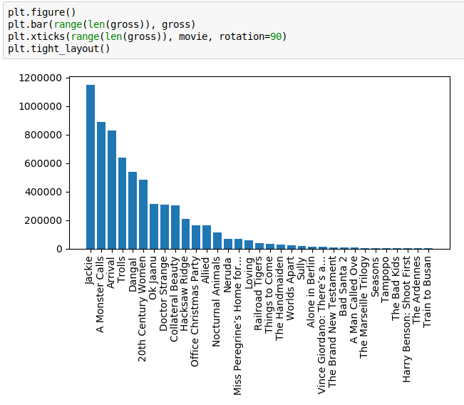
bars
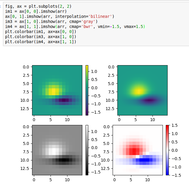
heatmaps
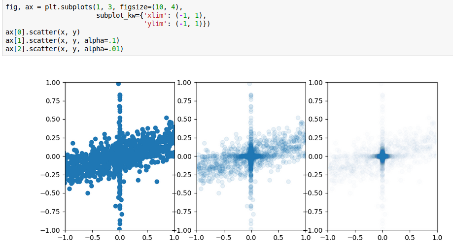
Overplotting
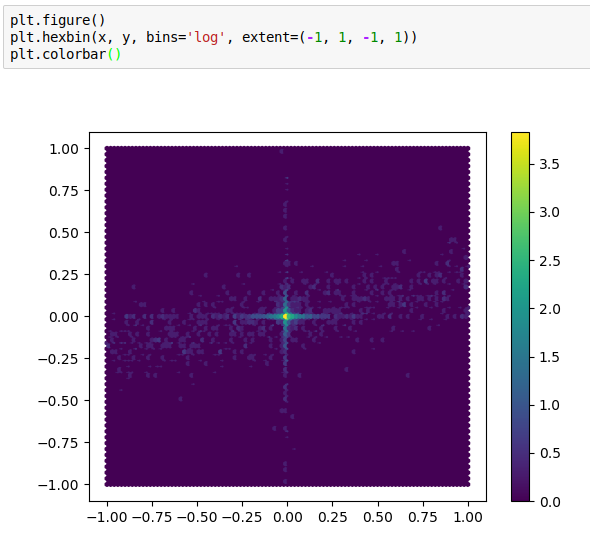
Hexgrids
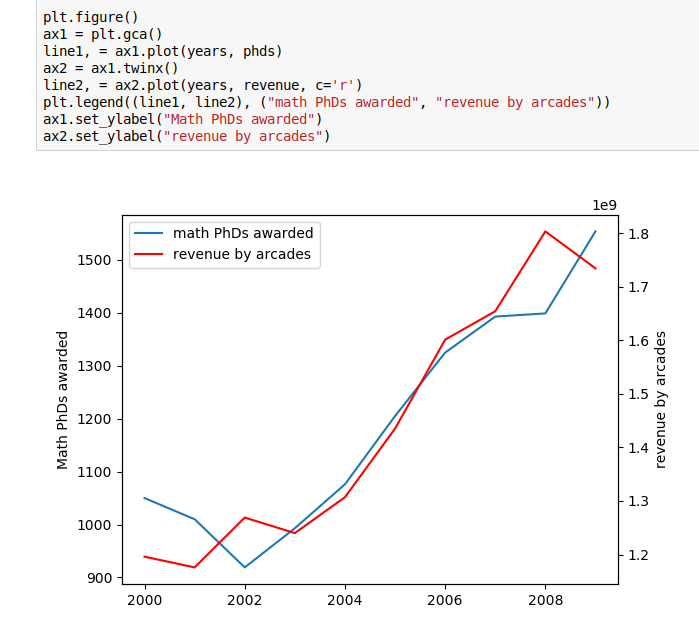
twinx and twiny
Gallery
Gallery: http://matplotlib.org/gallery.html
Plotting commands summary: http://matplotlib.org/api/pyplot_summary.html